


Overview
Studio Analytics is the dashboard where you can follow and analyze your omnichannel performance, allowing you to reshape your enrichment strategy.
This is a game-changer. Studio Analytics allows you to:
- Gain insight into how product content influences the performance of your products within a market
- (Re)align your enrichment strategy based on actionable insights
- Make informed marketing decisions
Studio Analytics gathers several metrics: three Productivity ones and five Business ones.
Let's take a look at these metrics.
Productivity:
- Time to enrich (average): to measure the average amount of time spent from the creation of the product to the first 100% completeness
- Number of enriched products (quantity): to measure the total number of products enriched over a defined period
-
Workflow completion (average): this metric is linked to your Enrichment Workflows: to measure the evolution of the time spent enriching the products in a workflow, step by step, over time.
These three metrics let you identify opportunities to streamline the product data enrichment process in Akeneo PIM so you can bring products to market faster.
This will help you increase visibility into the go-to-market process by tracking how long it takes enriching products in Akeneo PIM and understand where users spend the most time in Akeneo PIM.
The main benefits?
- Sell faster: identify ways to improve workflows to bring products to market faster.
- Work smarter: improve enrichment processes and team productivity.
Learn more at Akeneo Akademy
Walk through use cases and test Time-to-market insights in a dedicated practice environment.
Business:
- Total page views (quantity)
- Average add-to-cart rate/views (%)
- Average conversion rate/views (%)
- Total number of units sold (quantity)
- Total revenue (currency)
These five business metrics are available after installing the free "Akeneo app for Business Analytics" app. Check out this article to learn more about the app.
These business metrics will help you understand the product content's impact on sales performance on any of your sales channels.
The main benefits
- There is no need to leave the PIM to get business analytics anymore: everything is centralized in your PIM dashboard, and you can make your decisions easier and faster!
- Optimize content and workload based on your learnings.
Experience
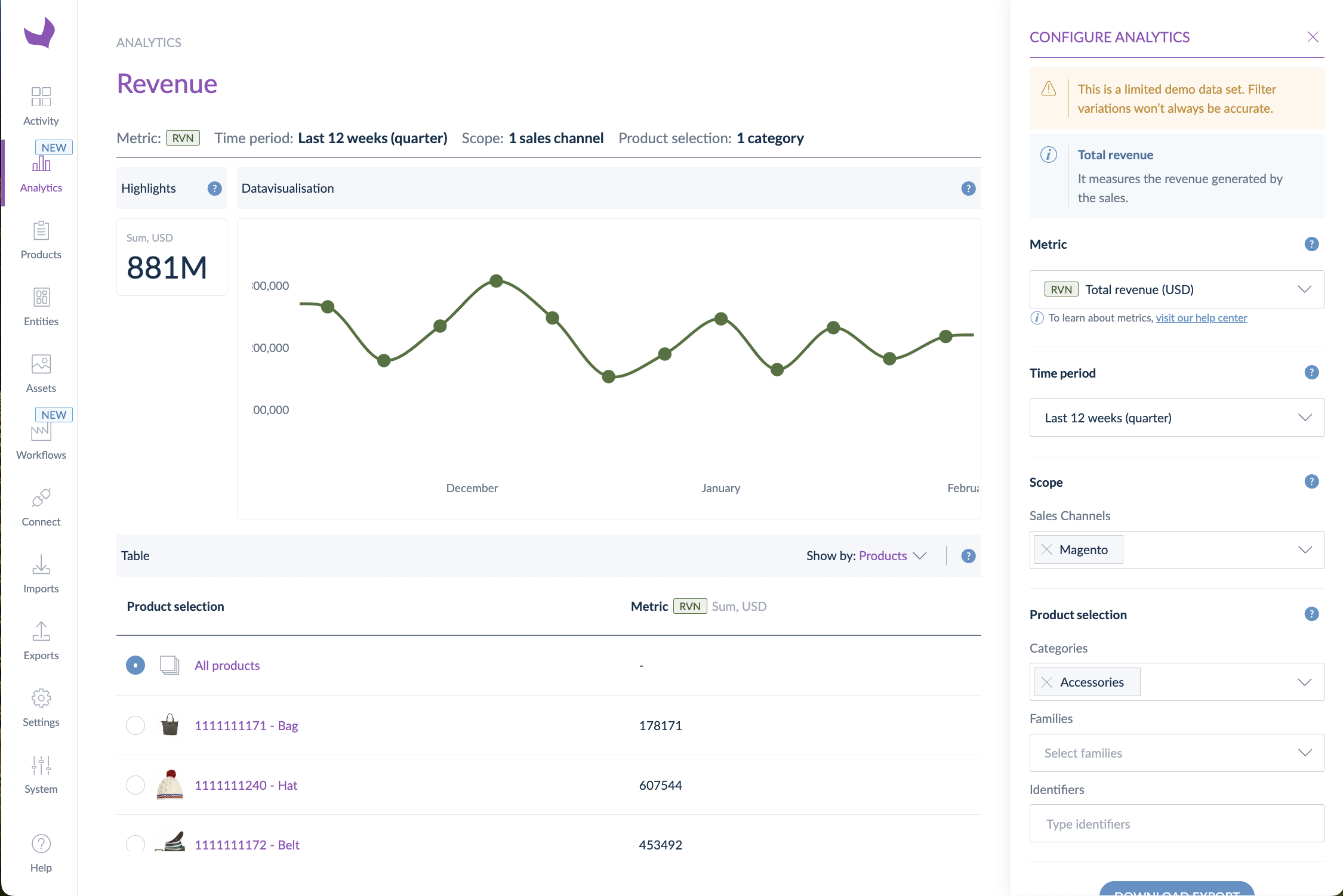
Studio Analytics is accessible directly through the main navigation panel. In this dashboard, we can identify four main features of the global experience.

- The Highlights block on the left of the graph provides a digest of your performance
- The graph provides a visual representation of the data
- The table gives you the expected result
- The control panel defines the metric and the associated filters you want to analyze and allows you to export data
Control panel
The control panel is the space where you configure your analytics.
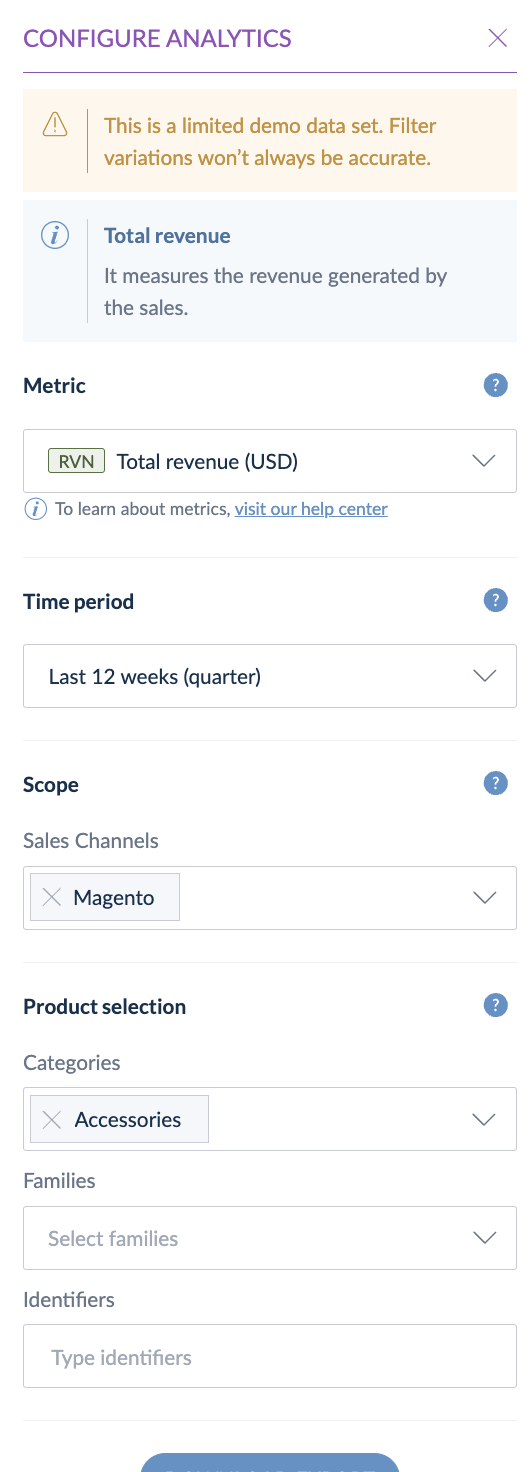
Metrics
Three metrics to analyze your time-to-market performance:
- Time-to-enrich
- Number of enriched products
- Average workflow completion
Five metrics to analyze the performance of your products in your markets:
- Total page views (quantity)
- Average add-to-cart rate/views (%)
- Average conversion rate/views (%)
- Total number of units sold (quantity)
- Total revenue (currency)
To display these business metrics, you must first install and configure our Akeneo app for Business Analytics. You'll find all the information in this article.
Time period
You can define the time frame you want to display for your analysis. 4 options are available:
- last 4 weeks (by default)
- last 12 weeks (quarter)
- last 12 months
- custom date range (possible from the launch of the feature in December 2022)
Scope
Depending on the type of metric you've selected, the options will differ.
- If you've selected a productivity metric (except Average workflow completion): your PIM channels and locales will be displayed.
- If you've selected a business metric: you'll see only the Sales channels you've previously set up in your Business Analytics app. Please see this article to learn more about the sales channels.
Product selection
Except for the Average workflow completion metric, you can define filters to select the products for which you want to analyze the performance based on three entities of the PIM: categories, families, and identifiers.
Each of these fields is a multi-select. When you select, for instance, the families “camcorders” and “cameras” plus the category “Multimedia,” then you'll get all the products that are both in these two families AND this category.
The analysis will encompass the entire product catalog if no filters are selected.
Export
- For the productivity metrics (except for Average Workflow Completion):
Once you click “Download report,” a graph snapshot and an XLXS file are downloaded in your browser, and you can access the data related to the control panel configuration.
- For the business metrics:
Once you click “Download report,” a graph snapshot is downloaded in your browser.
Graph and table visualization
Let’s analyze the capabilities available through the dashboard and the table visualization.
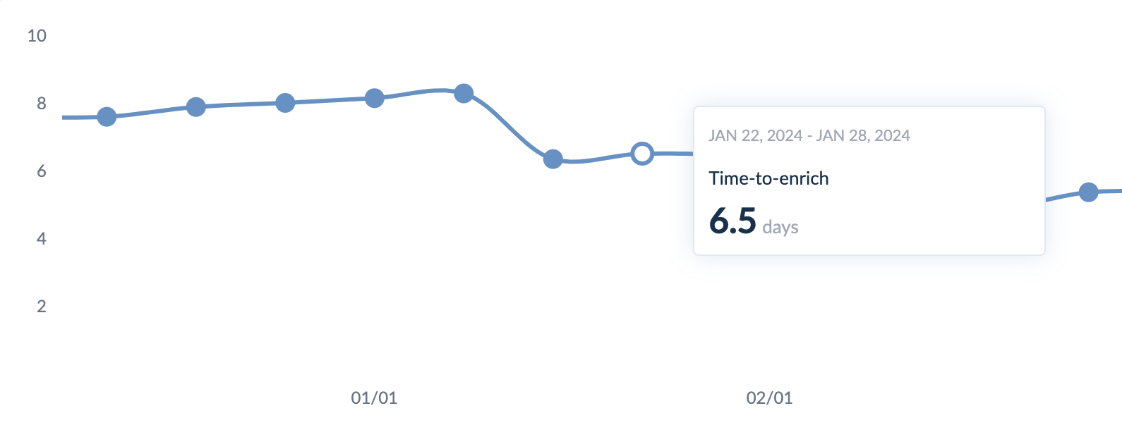
Graph
The caption summarizes the data defined in the configuration panel and is displayed in the graph below.

Hover over the chart to display a pop-up that displays details about the data you have selected.
Industry Benchmark (for time-to-enrich metric only)
Industry Benchmark allows you to compare the time spent enriching your products with your industry's peers, thanks to internal data gathered anonymously.
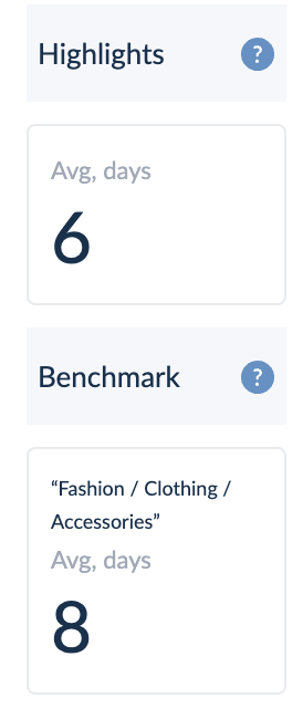
As a company, you might not access this feature as you're not part of a representative industry according to fixed quotas. We aim to share qualitative data based on the number of companies in a specific industry.
Industry benchmark appears only when there is no product selection to ensure a fair comparison.
Table
When you group the table results by Family, you can use the search bar to find a specific family.

The table rows are clickable and allow updating the chart above with your chosen data set.
All the data before 15th December 2022 is unavailable as we started tracking the usage at this time. This condition is the same for all products created before this period.
Show by
You can analyze the selected metric by grouping it through entities: Families, Categories, and Products.
The particularity of the Average Workflow Completion metric:
The Average workflow completion metric is slightly different from the others. It is linked to the Enrichment Workflows. Product selection is already done on the workflow side; that's why there are no filters in the dashboard for this metric.
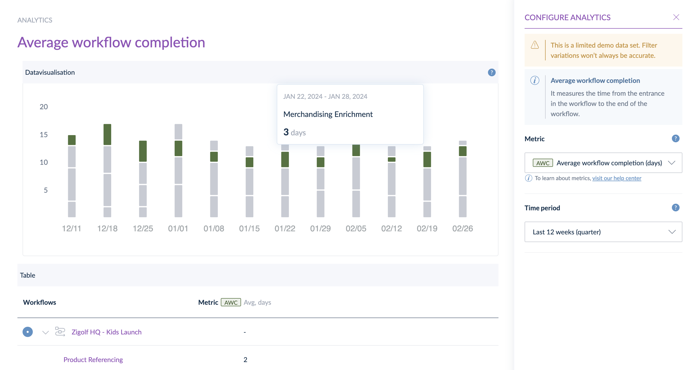
How is it calculated?
We consider the duration from the time a product enters a workflow step until the completion of that step. This calculation is performed for each step.
Table:
The results in the table are shown by “Workflows” only. We display the average duration of each step. When you hover a step in the table, it also hovers the step in the data visualization to ease the analysis. In the table, you must select the workflow first to enable the hover on the steps.
How to read the data visualization?
By default, we display the first workflow in the data visualization.
Each stack bar represents all the workflow steps over different period windows. Using the hover, you can easily follow the duration of each step over time.
Two benefits:
- Identify which steps last too long and lead to bottlenecks,
- Identify when delays occur and find correlations (for instance, the person in charge of this step was on holiday). It can be very useful to adapt your workflow/team organization.