
Where is the product grid?
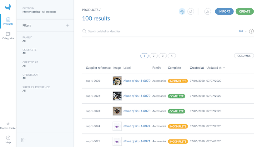
To access your products: click on Products. You will land on the product grid.
This page contains all the information you need to start working on your catalog: your products, your categories, some filters, and locales.
In the following sections, you will find out how to set up your work environment.
Locale context
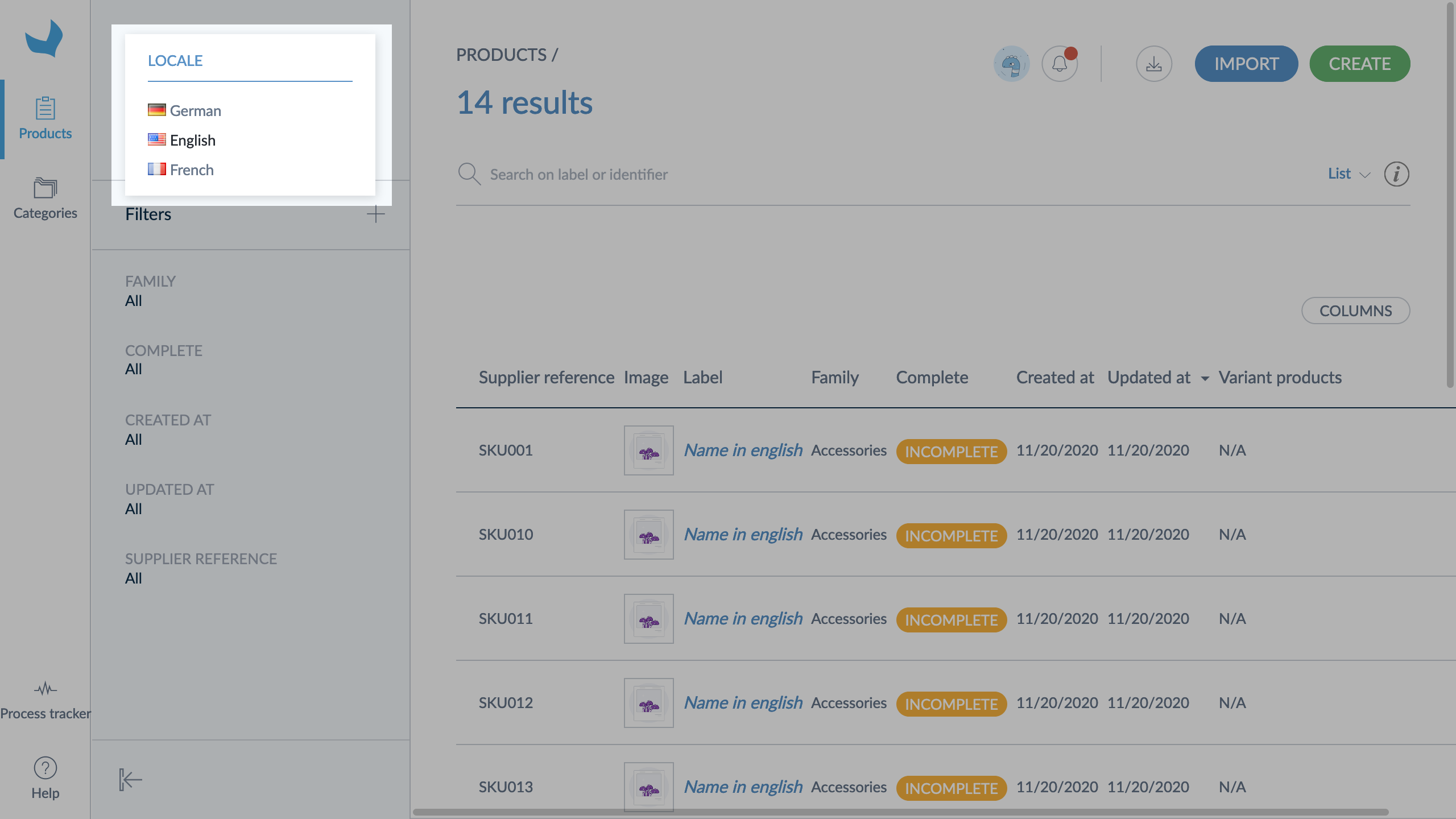
Select a locale context
The locale selected in the dropdown menu is your working locale. When you move from one locale to another, the following product information is updated in the product grid:
- The category labels (on the left panel)
- The attribute labels that can be used as filters (in the filter section on the left panel)
- The labels of attribute groups
- The attribute option labels used as values (in the product grid)
- The completeness
- The product or attribute values in the product grid
- The locales displayed are those required by the retailer for product enrichment.
- The working locale selected on the product grid page stays the same when you open or edit a product form.
- There are two types of locale, the working locale for your products and the user interface locale, which is the language you chose to work on your Onboarder.
Product grid view
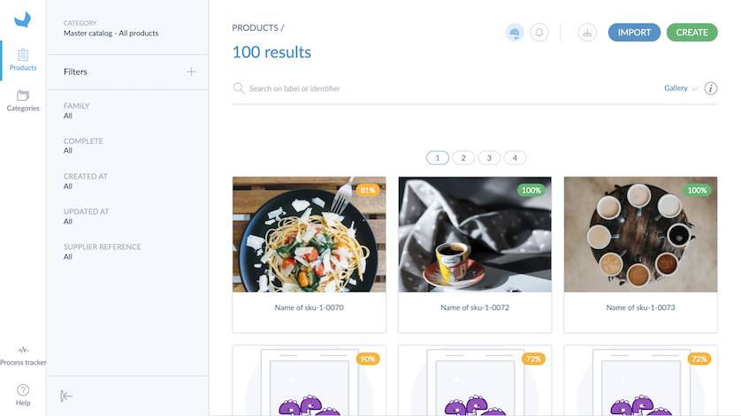
A Gallery view of the product grid is available. This view can be used to quickly identify and update products thanks to their image.
With the Gallery view, you can see the following properties in the grid:
- Supplier reference
- Label: attribute used as "label" in the family
- Image: attribute used as "main picture" in the family
- Completeness
- Number of complete variant products over the total number of variant products for a given product model (ex: "2/3" means that 2 variants out of 3 are complete, for the given product model)
Other grid features also apply to this view but are not displayed (channel, locale and category selection, filters, pagination, product selection, etc.)
To use the Gallery view:
- Click on List
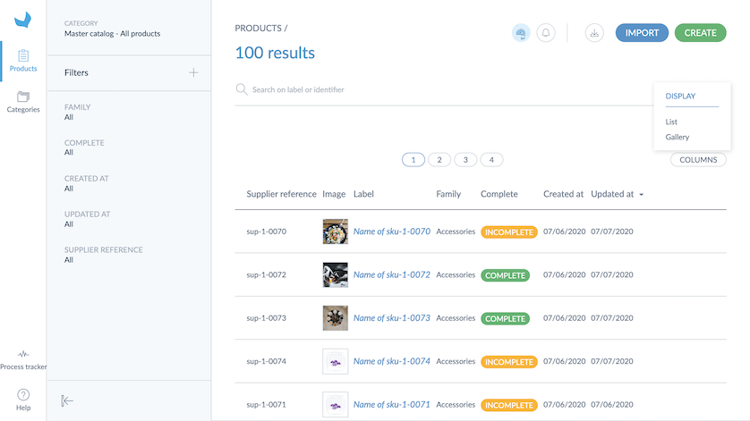
- Select the Gallery view
When you change your working locale, you keep all your selected filters active.
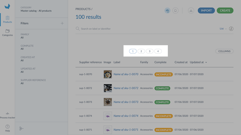
Product grid pagination
The product grid displays 25 products per page. To browse the product pages, click on the number of the page you want to reach.
The grid can display up to 400 pages (10000 products). However, you can use the filters in the grid to optimize the results displayed.
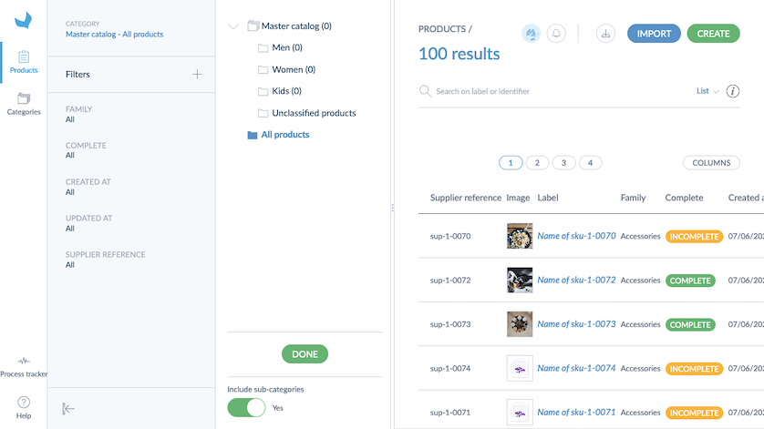
Category panel
Browse product categories
On the left side of the page, you will see the category panel. Thanks to this panel, you can easily navigate between category trees or between categories.
As a supplier, you can define your own category tree to easily find your products. The categories you define on your side won't be sent to the retailer.
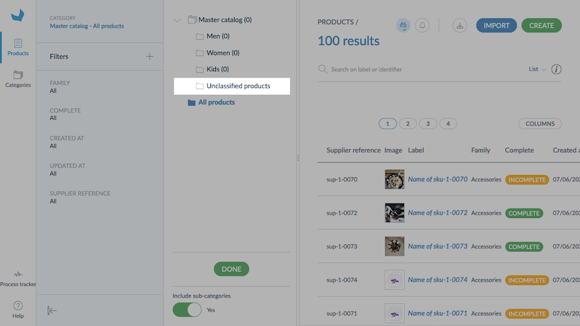
View unclassified products
Below the category tree, you will see an additional category: Unclassified products. Click on this category to see all unclassified products. This category is added automatically and cannot be removed or edited.
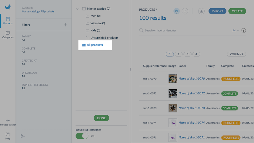
View all products
Click on All products to see all the products (categorized and uncategorized) of the selected category tree.
Product counter
The Onboarder displays the number of products available in each category and category tree. You will see a number into brackets nearby each category; this figure represents the total number of products classified in this category or sub-category.
At the bottom of the category tree, you will see a Yes/No option: Include sub-categories.
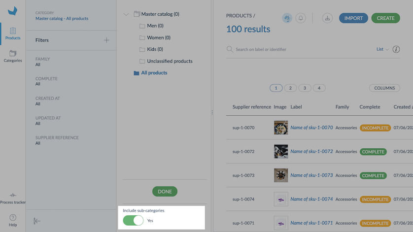
This option takes into account the number of products classified in sub-categories. By default, this option is set to Yes; hence sub-categories are included. If you do not want to take into account products classified in sub-categories, select No. The tree will then be updated accordingly.
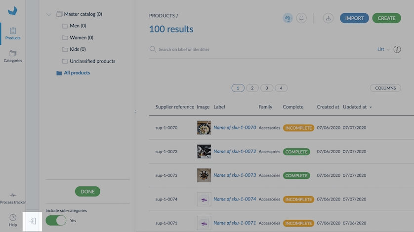
Hide or expand the category panel
To display the product grid widely, you can hide the category panel. To do so, click on the left arrow on the bottom right corner of the panel:
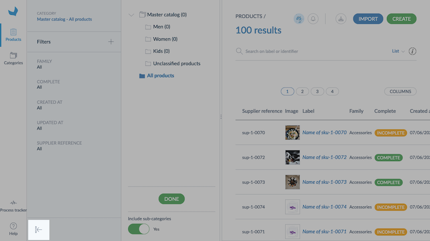
The category panel will be reduced automatically to the left side.
To expand the panel, click back on the arrow.
Customize the grid
Use filters
The product grid includes filter management.
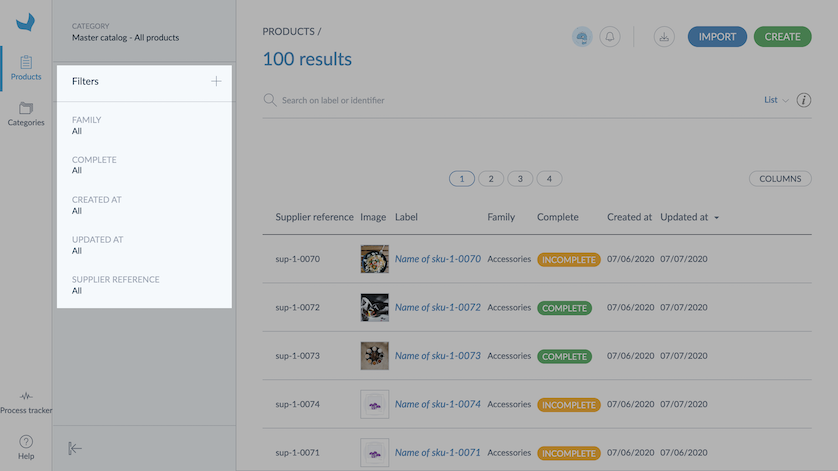
You can use the filters displayed or add new filters: click on the + icon and select the new attributes you want to use as filters.
If an attribute or an attribute option is not translated in the active locale, its code will be displayed into brackets. It will look like this: [name].
The filters can be applied to the following product information:
- Product information managed by the Onboarder: Family, Groups, Status, Completeness, Creation date, Updated date, Product identifier, Permissions
- Product information managed via the attributes
Search by label and identifier
To quickly find products, a search bar is available in the product grid. You can only search on the identifier (product identifier or product model code) and the label.
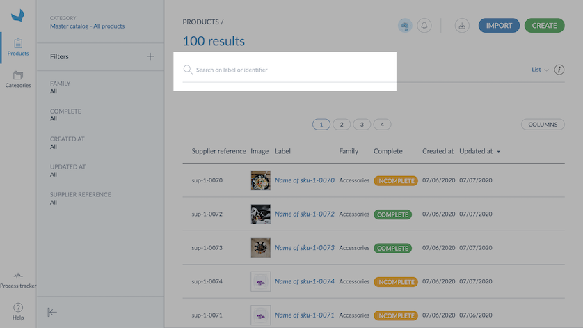
The search is based on a "contains" filter. For example, if you type in "can", it will display all the products or product models with an identifier/code or a label which contains "can".
You don't need to press enter to search, just enter a few characters, and results will appear.
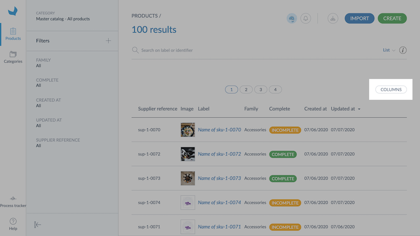
Configure grid columns
Now you're set up with your filters; you can select which columns you would like to see in the grid.
By default, it displays the following columns:
- ID (our product identifier)
- Label
- Family
- Complete
- Created on (the creation date of the product)
- Updated on (the latest update for this product)
Configure the columns
Click on Columns on the right side of the grid to display the column selection window:
On the left side of the window, you will see your attribute groups.
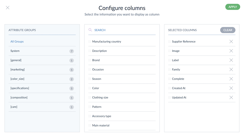
For each group, you will see the number of attributes. You will be able to use these attributes as columns in the grid. Click on a group to display its attributes in the middle block. Drag and drop the ones you need. From the right block, you can delete the attributes you don't want to display in your product grid, and you can reorganize them.
If you want to display all attributes, click on «All groups». On the right side, you will see your current grid columns.
Click on Apply to save your changes. Your customized grid will be displayed.
Sort values within the grid
When you hover your mouse over the column header, you can see arrows on the attributes you can use to sort the grid. To do so, click on the column header.
Some attribute types cannot be used to sort columns.
Action shortcuts on single products
There is a set of actions available for each product. They are available on the right side of the product grid when you hover your mouse over the product line:
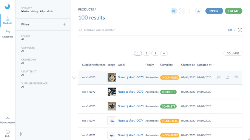
You will then be able to:
- edit the product information by clicking on the small pencil icon,
- edit its categories by clicking on the small folder icon,
- delete it with the trash bin icon (if not yet synchronized with the PIM).